
Case Study
HxA Rebrand
CHALLENGE
A nonprofit membership group of university professors and graduate students sought to help their brand image better match their mission of supporting diverse and open dialogues in the classroom and on campus.
SOLUTION
We sat down with members, staff, board members, and academic insiders to better understand the climate on campuses today, the need for a community like Heterodox Academy, and how to make it more welcoming to prospective members. We found a diverse group of educators with equally diverse perspectives on the matter. In embracing this multiplicity of viewpoints, we recommended brand and messaging updates that more dynamically and vibrantly center member voices—resulting in more approachable language, less telling, and more showing.

LOGO
The primary logo emphasizes the abbreviation commonly used by members—HxA—with the central “x” centering the opposition of multiple viewpoints. The full name is reserved for publications and for more academic audiences


tagline
The tagline “great minds don’t always think alike” playfully points to HxA’s purpose as a space for academics to host discussions among varying viewpoints.

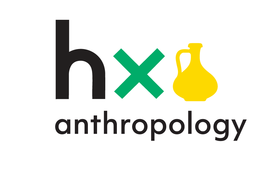
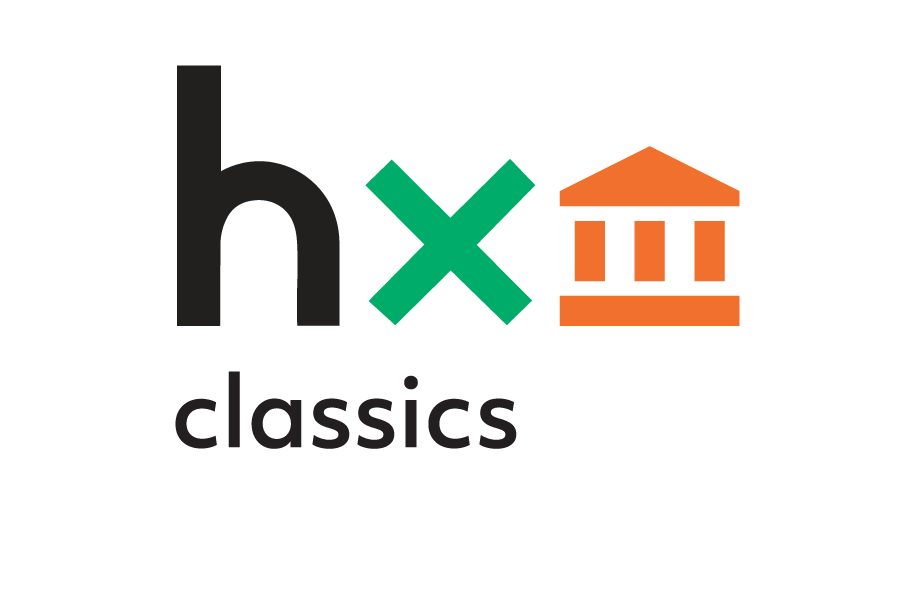
COBRANDING
Among the associated brands developed for the project was that of HxCommunities—a growing roster of discussion groups around specific disciplines. The use of simple geometric icons, anchored around HxA’s primary mark, allows for the library of HxCommunities brands to scale quickly and consistently.


Modularity
The primary logo is also open to modularity and adaptation over time; the animated version of the logo shows the power and dynamism of dialogue.

Colors
In reference to the collective problem solving that arises when opposing viewpoints meet, HxA’s main brand colors are secondary colors — the beautiful result of combining two opposite primary colors.

Icons
Simple geometric icons add a modern, welcoming pop and allow the brand’s library to grow over time.

Website
We designed a custom website template that could be shared & customized throughout the network.


Collateral


